Tuesday, April 29, 2014
Tuesday, April 22, 2014
PROJECT 12-Participation EXTRA CREDIT.
My lightning needs to be fixed because a lot of my image is very dark. I also didn't angle my camera correctly because you can still see the grid plane in the background.
PROJECT 12-Participation
My stick figures were disproportionate , and my shading could have been done better. I should have distinguished the main character and the enemies better.
PROJECT 11-Deliverable
Tuesday, April 15, 2014
Project 11 Participation
Matt Fishman
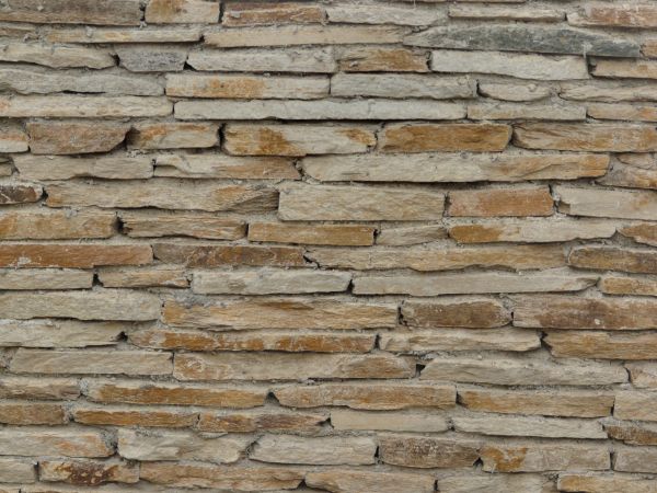
I cant really see the overall texture, but from afar it doesn't look stretched or squashed.The brick pattern looks realistic but I think the lighting can be improved a lot. In some of the pictures you have very hard lightning in which I can see circles overlapping each other.
Brian Eisenberg
I think the walls are a bit too short because the texture suggests that the walls are made up of three bricks. The texture doesn't looked stretched or squashed though. I think if the walls were higher or the bricks were smaller it would look more realistic. I think the lighting is pretty well done, although I believe you could have made more dramatic lightning to indicate more depth. The bump map is well done but could be improved
Monday, April 14, 2014
Tuesday, April 8, 2014
Tuesday, April 1, 2014
Subscribe to:
Comments (Atom)


